Data-streaming Charts > Adding trend-lines
Trend lines are horizontal lines spanning the chart canvas which aid in interpretation of data with respect to some pre-determined value. For example, if you are monitoring a stock's price, you can add trend lines to show yesterday's closing price or support/resistance levels.
You can add trend lines/zones to all the data streaming charts in FusionWidgets v3.
For each trend line on the chart, you need to define a <line> element under <trendLines> element as under:
<trendLines>
<line startValue='895' color='FF0000' displayvalue='Average' />
</trendLines>
<categories>
</categories>
<dataset seriesName='Google' showValues='0'>
</dataset>
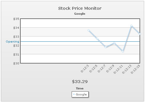
<trendlines>
<line startValue='32.45' displayValue='Opening' color='0372AB' />
</trendlines>
<styles>
<definition>
<style type='font' name='captionFont' size='14' />
</definition>
<application>
<apply toObject='Caption' styles='captionFont' />
<apply toObject='Realtimevalue' styles='captionFont' />
</application>
</styles>
</chart>
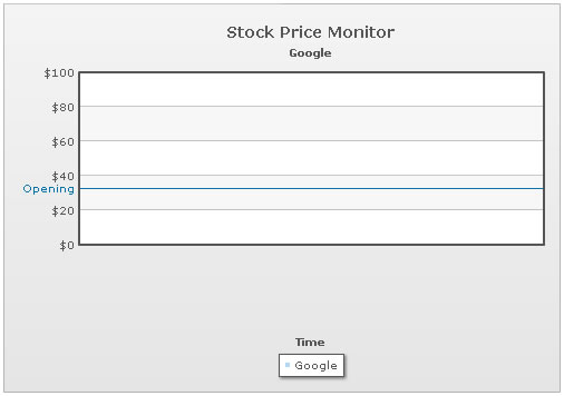
Here, we've added a trend line with value (specified as startValue) as 32.45 and given it a label of Opening. Also, we've specified its color.
When you now run the chart, you'll see the trend line as under. Since the chart has no data initially, therefore the chart limits are 0-100.
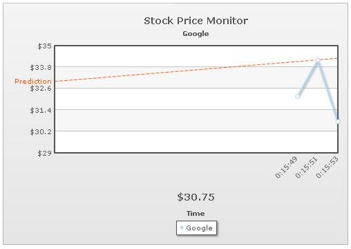
The data-streaming charts also allow you to create slanted trend lines by setting:
<line startValue='33' endValue='34.3' displayValue='Prediction' color='FF5904' dashed='1'/>
As you can see here, we've specified both the startValue and endValue attributes for the trend line. The values specified for these attributes should be within the limits of chart axis.
The above trend line would result in something as under:
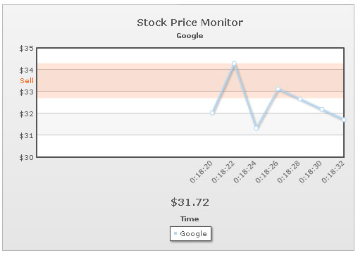
You can also create trend zones by setting:
<line startValue='32.7' endValue='34.3' displayValue='Sell' isTrendZone='1' alpha='15' color='FF5904'/>
For a trend zone, you need to specify both the startValue and endValue. Additionally, you need to set isTrendZone='1'.
This will result in something as under: