Funnel Chart > Creating a simple chart
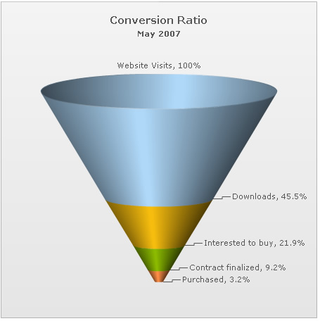
Since funnel charts are mostly used to show streamlined data, here, we'll create a simple funnel chart to show the "Sales Conversion Ratio" of a product website for a particular month. The chart will display the various processes involved in sales and how many targeted customers were filtered out in each process.
| Process | Number of People |
| Website Visits | 3,85,634 |
| Downloads | 1,75,631 |
| Interested to buy | 84,564 |
| Contract finalized | 35,654 |
| Purchased | 12,342 |
<set label="Website Visits" value="385634" />
<set label="Downloads" value="175631" />
<set label="Interested to buy" value="84564" />
<set label="Contract finalized" value="35654" />
<set label="Purchased" value="12342" />
<styles>
<definition>
<style type='font' name='captionFont' size='15' />
</definition>
<application>
<apply toObject='CAPTION' styles='captionFont' />
</application>
</styles>
</chart>
Here, we've:
- Defined the <chart> element and a few of its properties like caption, sub-caption, percent values set to on, decimals set to 1 and base font size.
- Added a <set> element for each data row that we had in the table.
- Created STYLE to increase caption font size.
When you now view the chart (after embedding it in HTML code) with above XML, you'll see it as under (we've clicked on a slice here to show the slicing effect):
FusionWidgets has created the funnel segments based on your data provided. Also, it has converted the numbers into percentage, since we had set <chart showPercentValues='1' ..>.
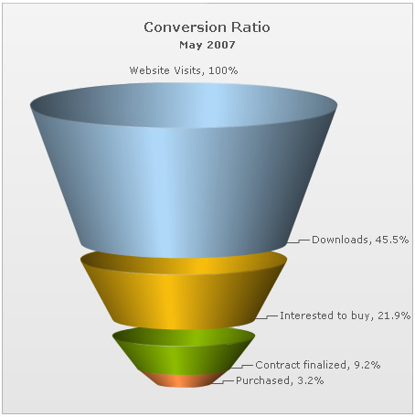
In the above example, each funnel slice has its width according to its data (top and bottom openings proportional to data in and out respectively, to get a visual cue of the funneling rate as compared to other funnels depicting funneling/screening rate of allied processes). However, if you do not want the width of each funnel to depend on its data, you can set:
<chart useSameSlantAngle='1' ...>
This will result in: