Funnel Chart > Section Funnel Chart
In the previous example we had shown how to create a streamlined funnel chart, i.e., chart whose data equals 100% when totalled. However, FusionWidgets also allows you to create non-streamlined charts, where height of each funnel segment depicts its value with respect to the entire funnel height. There is no filtering of data involved in this case.
| Employee Name | Sales ($) |
| Buchanan | 20,000 |
| Callahan | 49,000 |
| Davolio | 63,000 |
| Dodsworth | 41,000 |
| Fuller | 74,000 |
| King | 49,000 |
| Leverling | 77,000 |
| Peacock | 54,000 |
| Suyama | 14,000 |
<chart caption='Sales distribution by Employee' subCaption='Jan 07 - Jul 07' numberPrefix='$' isSliced='1' streamlinedData='0' isHollow='0'>
<set label='Buchanan' value='20000' />
<set label='Callahan' value='49000' />
<set label='Davolio' value='63000' />
<set label='Dodsworth' value='41000' />
<set label='Fuller' value='74000' />
<set label='King' value='49000' />
<set label='Leverling' value='77000' />
<set label='Peacock' value='54000' />
<set label='Suyama' value='14000' />
<styles>
<definition>
<style type='font' name='captionFont' size='15' />
</definition>
<application>
<apply toObject='CAPTION' styles='captionFont' />
</application>
</styles>
</chart>
Here, we've:
- Defined the <chart> element with caption, sub-caption, number prefix.
- To convey the chart that we're not plotting streamlined data, we also add streamlinedData='0' atttribute to <chart> element.
- We also configure the funnel slices to show up as filled by setting isHollow='0' and also set each slice to show separated from each other by setting isSliced='1'
- Thereafter, we provide data for each employee.
- Finally, we apply style to increase caption font size.
When you see this chart, you'll get a result as under:
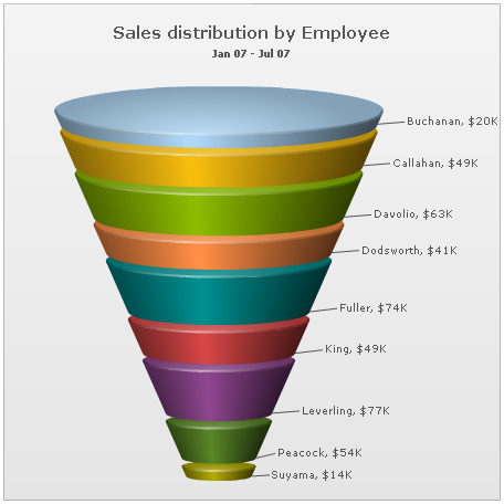
As you can see above, the chart has now rendered each funnel slice with a common slant angle. The height of each funnel represents its value.
Also, in this chart, since we've set isSliced='1' at chart level, the slicing interaction won't work.